Type, color & stroke
Typography
The more important the data, the larger the font. Most SCROLL users view from 10–30 feet; small text presents really small at that range. Size the hierarchy by importance, and let the hero dominate.
Fonts are bitmap and UPPERCASE ONLY — .upper() everything; 5x5 is the sole
font with a full lowercase set. Roles, by catalog usage:
| Role | Wide (128+) | Narrow (64) |
|---|---|---|
| Eyebrow / label / meta / chip | 4x5 (the workhorse) | 4x5 |
| Body & list rows | 5x7 (or 4x7) | 4x5 |
| Sub-head | 6x8 | 5x7 |
| Hero value (one per page) | 16x20 / 16x24 | 10x16 |
| Hero on a filled background | 10x16_outline | 10x15_outline |
| Footnote | picopixel / 4x5 | picopixel |
All 40 faces, at real size: Fonts reference.
Design for the worst case, not the average
The longest possible string is the design point. If the app shows MLB teams, "WASHINGTON" is the string that must fit — or there must be a plan: truncate deliberately, or switch to an abbreviation that fits the space.
Fit with a ladder, then clip by hand
c.text_fit() picks the biggest font that fits — but when even the smallest overflows
it still draws (nothing in the API clips). The catalog's answer, in 80 apps, is a
_fit_clip(c, text, fonts, maxw) helper: pick the largest that fits, then hard-clip.
Canonical ladders:
NODATA_FONTS = ["10x16", "6x8", "5x7", "4x5"]   # error titles, 40 apps verbatim
["6x8", "5x7", "4x5"]                            # narrow headline
["10x16", "6x8", "5x7"]                          # wide headline
Clip at a word boundary when the tail is a whole word, but not when that costs more
than ~30% of the string. When a wrapped block drops lines, append ".." so the cut
reads as deliberate.
No overlapping text, ever
Text may only sit on other drawn pixels when text_stroke separates it from what's
behind. Measure before committing (c.text_width, or the measure_text tool over
MCP); a right-aligned draw with no bound grows leftward into its neighbor the day a
longer string appears.
Font traps (all silent)
3x4has no space glyph — "HARD FREEZE" draws as HARDFREEZE. Single words only.8x12's-glyph is a solid block — skip it in ladders for hyphenated strings.- Starlark has no font-metrics call, so carry a height table:
FONTH = {"16x20": 20, "10x16": 16, "10x15": 15, "6x8": 8, "5x7": 7, "4x5": 5}.
The outline fonts
10x15_outline and 10x16_outline carry a border inside the glyphs — every letter
arrives already outlined, in the one color you pass. They are the hero faces for a
lockup on a filled or tinted background, and they need no text_stroke.


10x15 over 10x15_outline. Right: the outline faces on a tinted ground — the edge is in the glyph, so the fill can't swallow it.Color & contrast
High contrast is a requirement, not a taste. These are LEDs viewed across a room — high-contrast text against the background is what pulls information off the screen and into the eye.
- Limit full-colored backgrounds. Black backgrounds are very good — they are the cheapest high contrast there is. On scroll apps especially, avoid full-color background images when they aren't necessary (they also fight the apps before and after in the rotation).
- If a full-colored background is used, stroke the text.
c.text_stroke()
c.text_stroke(s, x, y, font="5x7", color="white", stroke="black", thickness=1, align="left")
text_stroke draws a border around every glyph (it mirrors the panel's
drawTextWithStroke). When the goal is contrast on a colored background, black is
the stroke to reach for — and the API's default — because it restores the
black-background contrast locally around each letter.
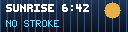
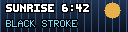
c.text. Right: c.text_stroke(…, stroke="black").But stroke= is a general parameter, not a contrast-only tool. A colored stroke as a
design choice — white text with a blue outline, say — is fully supported and yours to
call. thickness=2 doubles the border. Give pixel art a creative outline for the same
separation.
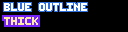
stroke="#2F6FDC", and stroke="#7521F9", thickness=2. A design choice, not a fix.The catalog agrees on the default: the only shipped apps using text_stroke are
exactly the full-background ones (sun-arc, rain-radar).
What the colors mean
Semantics the catalog agrees on:
- White is the resting color for live numbers — "which leaves amber and red free
to mean something the moment they appear" (
citi-bike). Gray (gray/#6E7A94) for labels. - Green = up / open / ok · amber = attention · red = alarm. "Red is the only state allowed to shout; everything else is built quiet enough that it can."
- Keep brand and alarm distinct (
todoist-scroll: brand#E44332, overdue#FF3B30— "so brand and alarm never fight"). - Thresholds are banded
[label, color]pairs from one function, so the color and the word can never disagree. - Past / present / future = full / dim / gray — declare dim twins, or use
color.dim(col, pct)for tracks and washes.
The palette is LED-tuned
The named palette is tuned for the panel (green is (0, 220, 70), not lime; brand
purple is #7521F9; skyblue is #78DCFF) — see every swatch on the
Drawing API page. Panels are RGB565, so subtle
shades collapse: keep values punchy and separated.
Near-black tinted fills and vertical near-black gradients (#0A1220 → #1E3350) are
the catalog's compromise between a mood and a black ground — never a bright fill. On
filled chips and rows, compute contrast: flip the text to black when the fill's
brightness passes ~150.